Re-creation of K10k’s iconic front page design, build in Figma. Crafted with care. Auto-layout friendly.
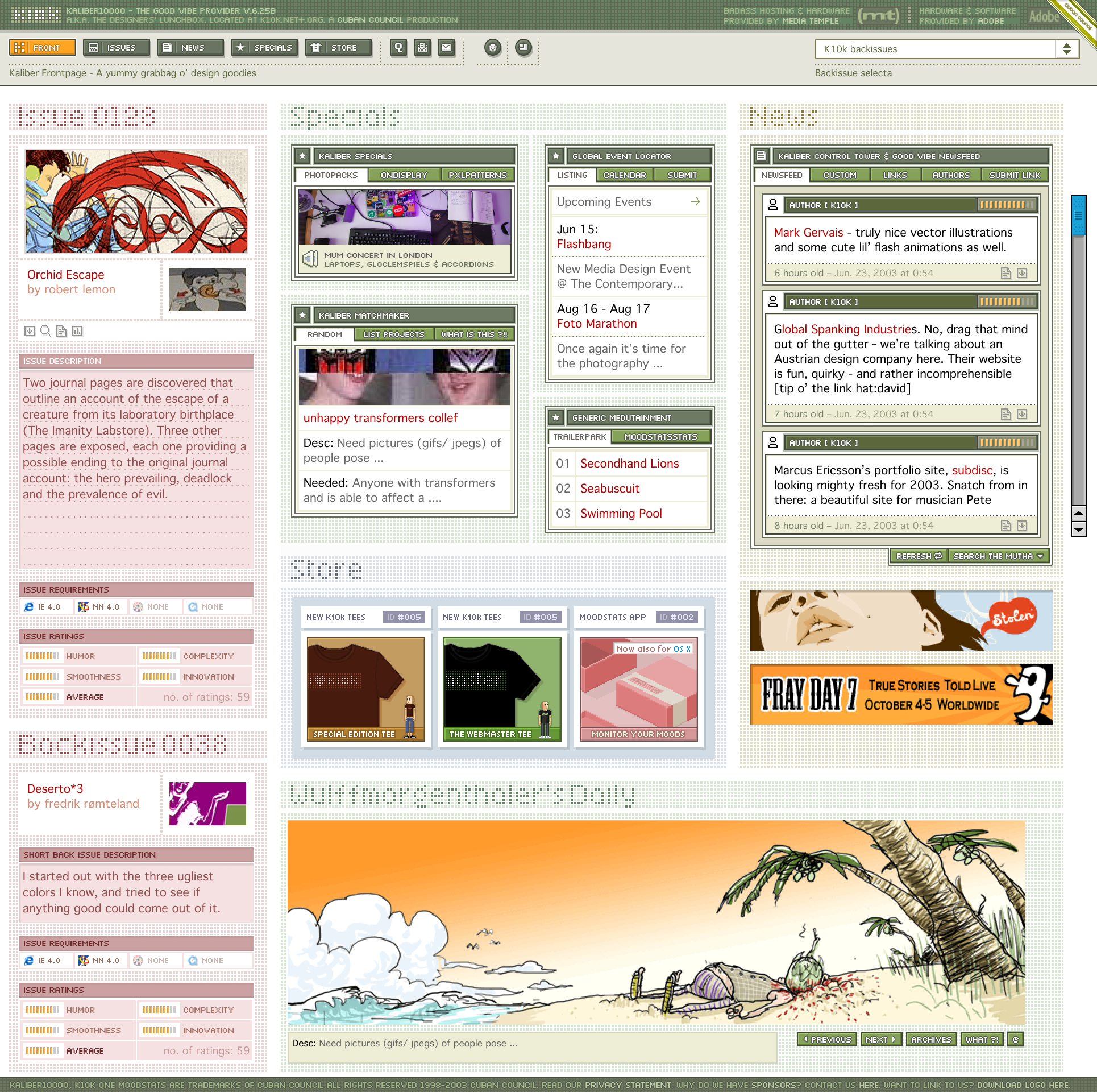
Front page example.
Colophon
- Although I tried, I couldn’t locate the original pixel font used on the site (Five Dots) by designer Susan Kare so I substituted Silkscreen (recently made available on Google fonts) by Jason Kottke. It’s the closest match I could come up with and works well enough as a substitute when letter spacing is adjusted.
- Before @font-face and webfonts were a thing, designers could specify font “stacks” in styling - basically a list of typefaces for the browser to try for text rendering in a comma separated list of fallback choices. Stacks were usually chosen from common fonts already installed in user’s operating systems. If the designer wanted to use a font that wasn’t commonly installed on viewers computers, they would usually create the text in a graphics editor like photoshop and save it as a gif or jpeg and reference the image in the html.
- In the early 2000s, it was common to design for 800x600 or even 1024x768 screen resolutions. Today, you may need to break out the magnifying glass to read these small fonts on a high resolution screen, but a 10pt size wasn’t quite as bad on a low resolution screen. Still though…
- A few details were omitted or changed from the original design (the angled edges on “tabs”, aliased edges on some of the text, etc.) but overall, I think it represents a fairly true reproduction of the site. Hope it brings back good vibes for you!